WET PAINT
In the modern world where reading is falling by the wayside, book cover design is becoming even more important. If we want to encourage young people, especially Gen Z, to read long form content, we need to design covers that stand out on the shelf and in thumbnail-size for e-reading.
Target Audience
The target audience is urban women ages 16-45 who are interested in hearing and supporting female voices.
Design Problem
The main challenge in designing the book cover of Wet Paint is designing a cover that competes with the other content pulling viewers’ attention. For this novel in particular, the challenge was to create a cover that accurately conveys the fun, fresh and modern attitude of the book and author.

Design Process
The jumping off point for my design process was the title, Wet Paint. The title calls to mind a physical experience that everyone can instantly imagine, so I wanted to keep the cover design equally material. I explored different combinations of paint imagery and typography to convey the idea of Wet Paint.

Design Solution
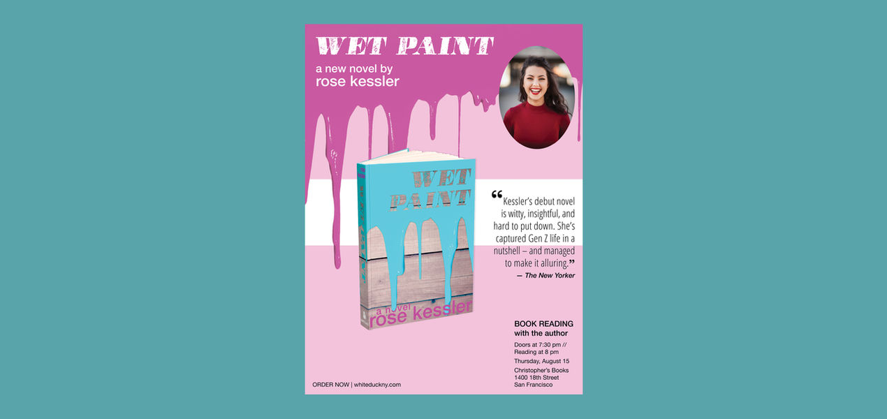
Although the cliche “Wet Paint” sign is a printed paper sign posted near the painted surface, I decided that the idea would be equally well conveyed using a close-up image of dripping painted with the title in a cutout stamp font. The wood background calls to mind the classic just-painted bench. For the colorsI chose deeply saturated complimentary colors. The palette, together with the three dimensionality of the imagery, makes the cover jump off the shelf.

Inside Spreads
Associated Materials
The goal with the associated materials (book reading poster, book reading flier, print ad) was to allow viewers to immediately associate the print material with the book. I used the dripping paint image, fonts and color palette to maintain consistency with the book cover.
Book Reading Poster
Book Reading Flier
Book Release Print Ad
Software
Photoshop | InDesign


